
Bentley Motors Unveils New Wings

2025 Bentley Logo: ‘Flying B’
Bentley Motors today unveiled its vision for the future by debuting a new, modern emblem while also teasing a new concept car that will be unveiled on July 8th.
For only the 5th time in the company’s history, Bentley has unveiled a new ‘Bentley Wings’ emblem. The new ‘Winged B’ is just the fifth iteration in Bentley’s entire 106-year history and will make its debut on the reveal of a new future vision concept car.
The original ‘Winged B’ was designed by F. Gordon Crosby in 1919 and has only ever been redesigned in 1931, the 1990s and again in 2002. However, this latest iteration is the biggest change to one of the most iconic logos of all time.
The new logo was created in-house under the direction of Director of Design Robin Page and will mark the first step in Bentley's next chapter. The logo will make its debut on July 8th on a concept car that, although not slated for production, will preview the future design language under Robin.
The new Winged B
Robin Page and a small internal team led the design of the new Winged B. The process began with a competition that allowed the entire design team to submit concepts and sketches. Young Nam, a member of the Interior Design Team, proposed the final design.
The mission was to capture some of the beautiful details from the previous designs, such as the diamond pattern of the inner wings and the B centre jewel. The shape of the new wings themselves is sharper and more dramatic, and is more reminiscent of the angled wings of a Peregrine Falcon. The lower feathers underneath the B have been removed entirely.
The center of the wings retains the B centre jewel, but is redesigned in such a way that the jewel can stand alone without the need of the wings. The jewel has also been redesigned to capture the high-quality details most often seen in luxury watch designs, such as the beveled glass edge and chamfered metal surround, with a 3D depth of the ‘B’.
The History of the Winged B
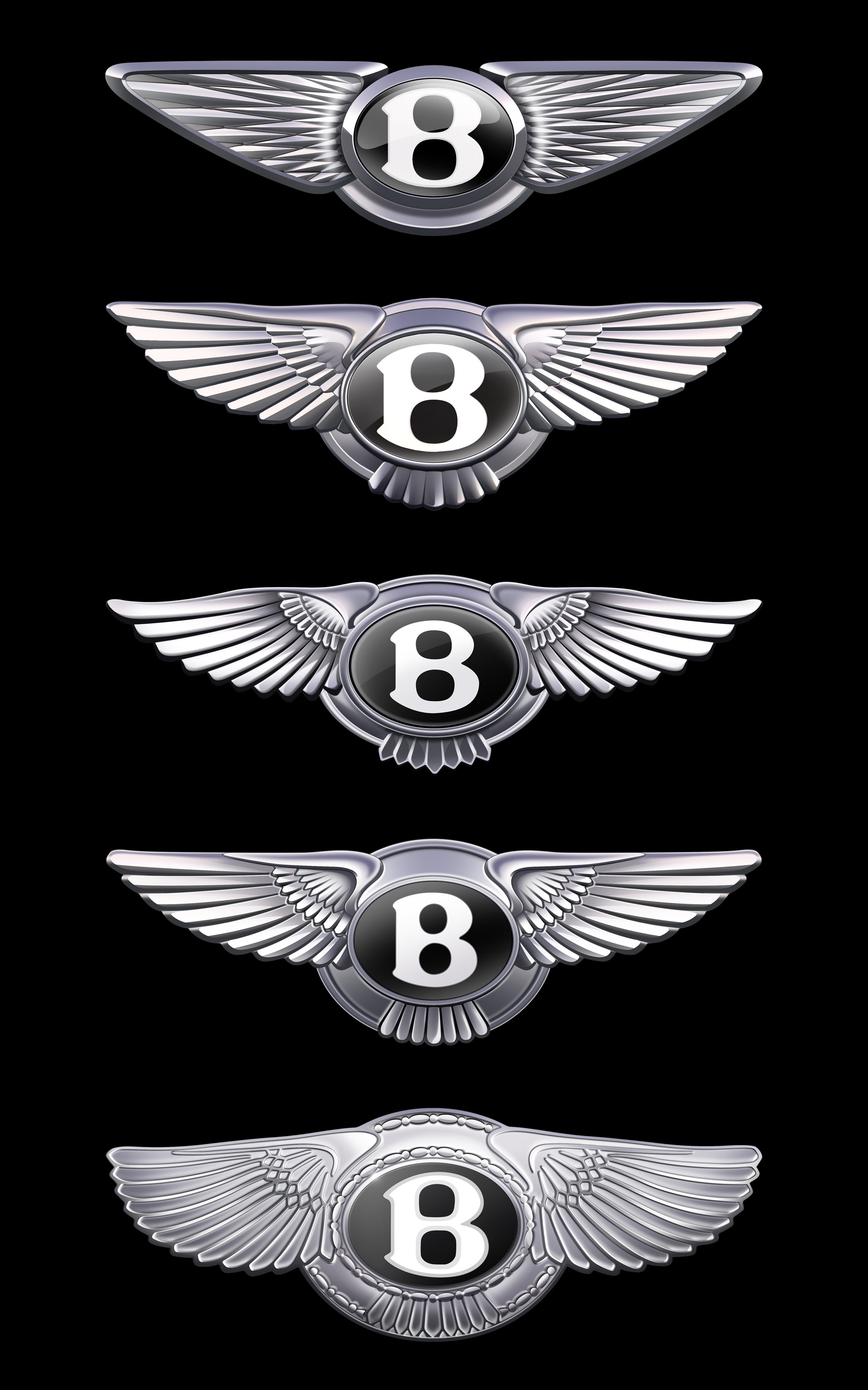
Evolution of the ‘Flying B’
The core elements of the Bentley logo have remained the same: a prominent “B” at the heart of the design, flanked by a pair of feathered wings. When W.O. Bentley founded the company in 1919, he sought an emblem that embodied his quest to push the boundaries of performance. He turned to his friend F. Gordon Crosby, who was the most famous motoring artist of the pre-war years. Crosby created the original Winged B and chose a pair of wings to represent the exhilaration of motion and potentially a reference to W.O. Bentley’s background as a designer of engines for fighter planes in WWI.
Notably, Crosby gave each wing a different number of feathers to make it completely unique.
When Bentley passed ownership to Rolls-Royce in 1931, a new emblem was created. This one was symmetrical, with 10 straightened feathers on each side flanking a simpler ‘B’ in a planar black oval. This version was the longest-standing example in the company’s history and was in use until the third revision in 1996. The 3rd iteration was a nod to Crosby with the central ‘B’ being revised to echo the original, and overall became more ornate, and a more pronounced curvature returned to the wings.
The next iteration occurred when Bentley was acquired by the Volkswagen Group in 1998, paving the way for the launch of the first Continental GT in 2002. For the new era, Bentley used the Continental GT, which took production from 1,000 annual units to 10,000. The new logo for the Continental GT honored the 1919 design by reverting to an asymmetric design with 10 feathers to the left and 11 to the right.
In that same spirit, the 2025 emblem will usher in the next chapter of Bentley by being unveiled at the campus in Crewe on July 7th and ahain on Tuesday, July 8th on the new concept car.